


 扫码支付更轻松

1.功能
热图,主要使用渐变颜色来展现数据在不同样本中的变化规律,本工具除了支持为热图添加分组注释条,也可以指定展示特定的文字标签,即使绘制上百个基因的热图,基因标签也不会重叠在一起。

2.应用
适用于转录组、代谢组、蛋白组、16S、实验结果采集等所有适合绘制热图的数据。
3.输入
矩阵表格文件:任何与丰度相关的表达量数据都可作为热图的输入数据。一般第一行为样品名,第一列为基因名、蛋白名等,如下。注意,第一列的列名不能为空!

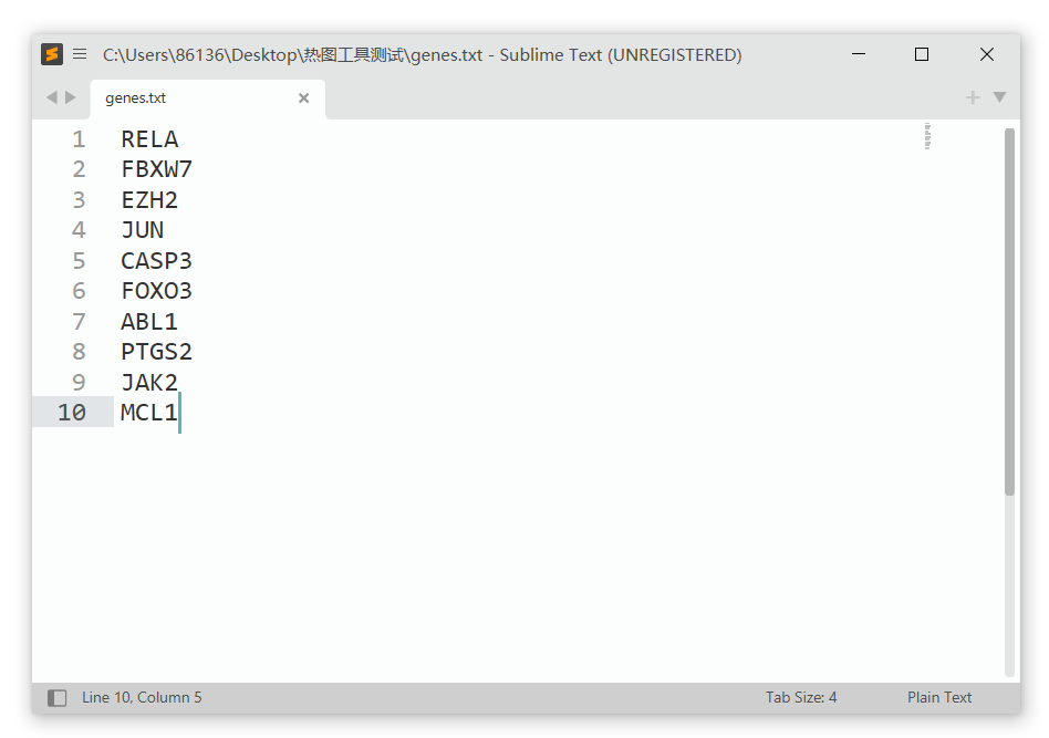
标签文件(非必需):单列文本文件,用于在热图上添加特定的文本标签。注意,这些文本标签必须在矩阵表格文件的第一列中能找到。如果上传一个“空文件”(至少包含一个热图不存在的标签),绘制的热图则不展示标签。
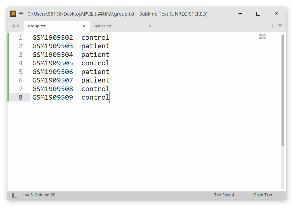
分组文件(非必需):双列文本文件,第1列必须为样本名,第2列必须为分组名。注意,样本名必须与矩阵表格文件的列名一致。
输入文件为数据框表格文件,文件格式支持txt(制表符分隔)文本文件、csv(逗号分隔)文本文件、以及Excel专用的xlsx格式,同样支持旧版Excel的xls(Excel 97-2003 )格式。
4.主要参数
a.选择用于作图的列:
选择矩阵表格文件中的哪几列用于热图的数据区域展示,例如填入“2-4,6-8”表示仅选择2、3、4、6、7、8这6列数据用于热图绘制(由于第1列为基因名,不包含在内);不填则默认将全部列用于作图。
b.归一化:
对数据进行Z-score归一化处理,选择列、行或不处理,一般默认选择行(row)进行归一化。若在表格中同一个基因的表达量在列的方向上排布,则选择列(column)进行归一化。
c.聚类:
选择是否对行/列进行聚类(Hierarchical clustering),默认对行列都聚类。
显示聚类树:可以自定义选择是否显示行或列方向的聚类树。
聚类树高度和宽度:分别指定上方和左侧聚类树的高度,默认20mm。
d.标签与数值
是否隐藏标签:是否隐藏热图的行标签(如基因id、Symbol等),默认否。例如,当热图的基因标签太多而重叠到一起时,也可以选择隐藏全部标签。
在格子上显示数字:在热图格子中显示矩阵表格文件中的数值,如相关性系数、P value等。
e.颜色:
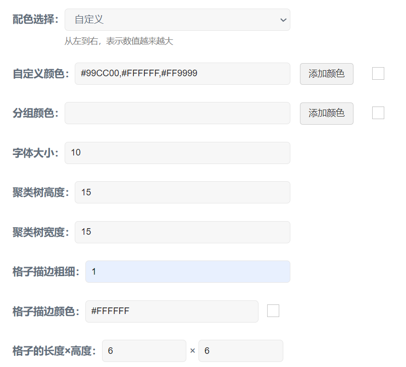
配色选择: 默认green black red,还可选择navy white firebrick3或olive white pink;也可以选择自定义,在调色板里添加所需颜色或者直接输入十六进制色号(英文逗号分隔),三个颜色从左往右表示代表的数值越来越大。
分组颜色: 自定义分组注释条的颜色,添加的颜色数量应与分组文件中的分组数量相同。
f.字体大小:设定热图行名和列名的字体大小,默认10 pt(points)。
g.格子的长度和高度:设置热图格子(Cell)的大小,单位为mm,默认空值,即格子比例自适应。如果绘制方格热图,可将格子的长度和高度设置为相同的数值,例如5x5。注意,格子的大小最终影响整个热图的大小。
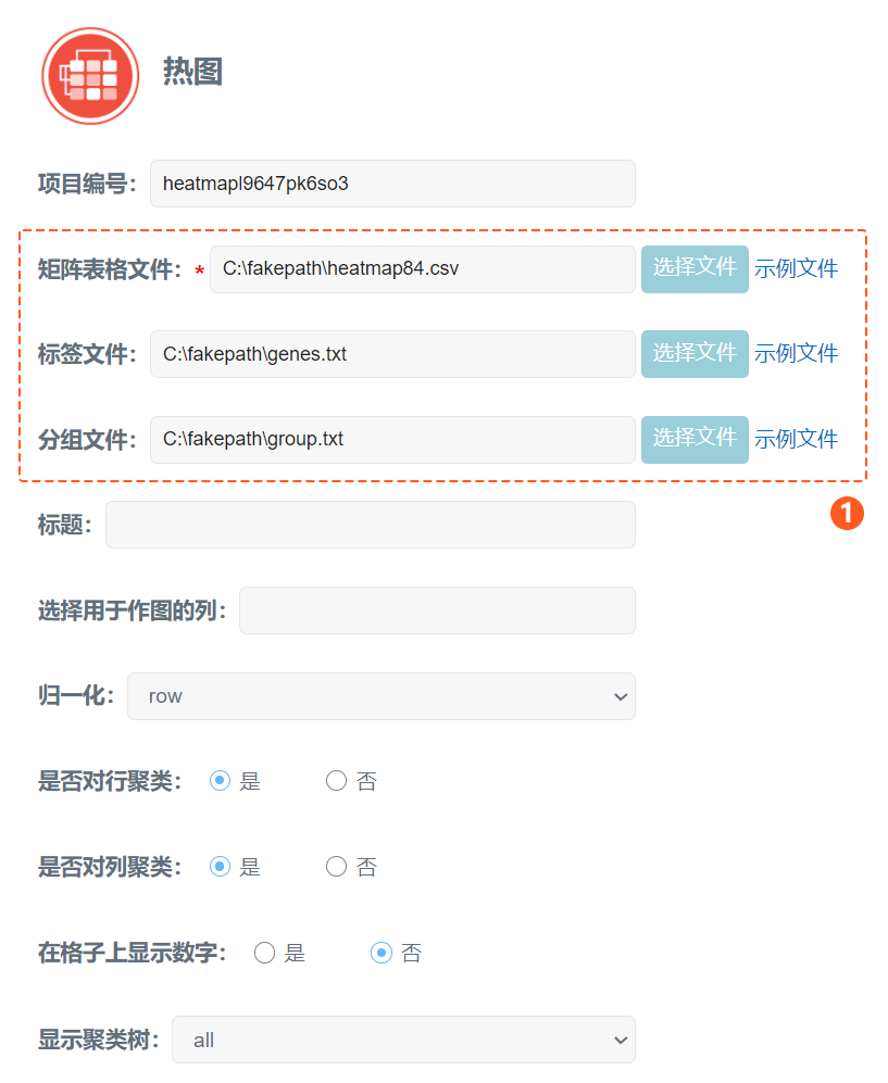
首先,上传作图数据。点击选择文件按钮,依次上传表达量表格文件、标签文件、分组文件,数据处理方法选择对行进行归一化,并对行、列进行聚类,如下图。
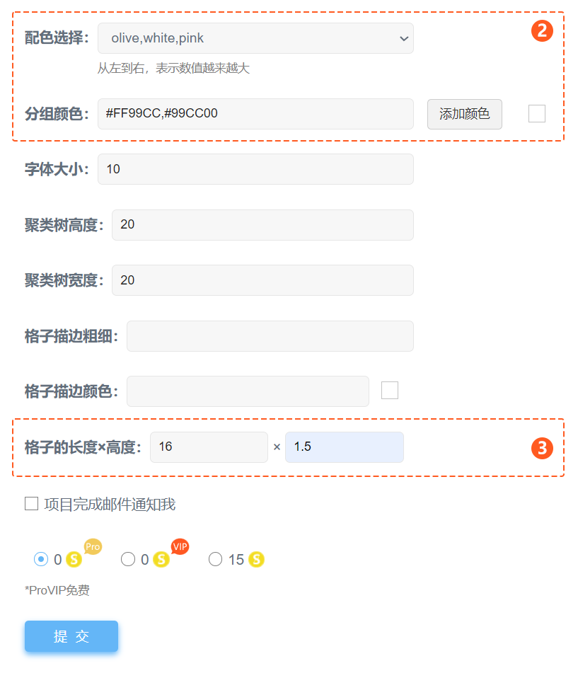
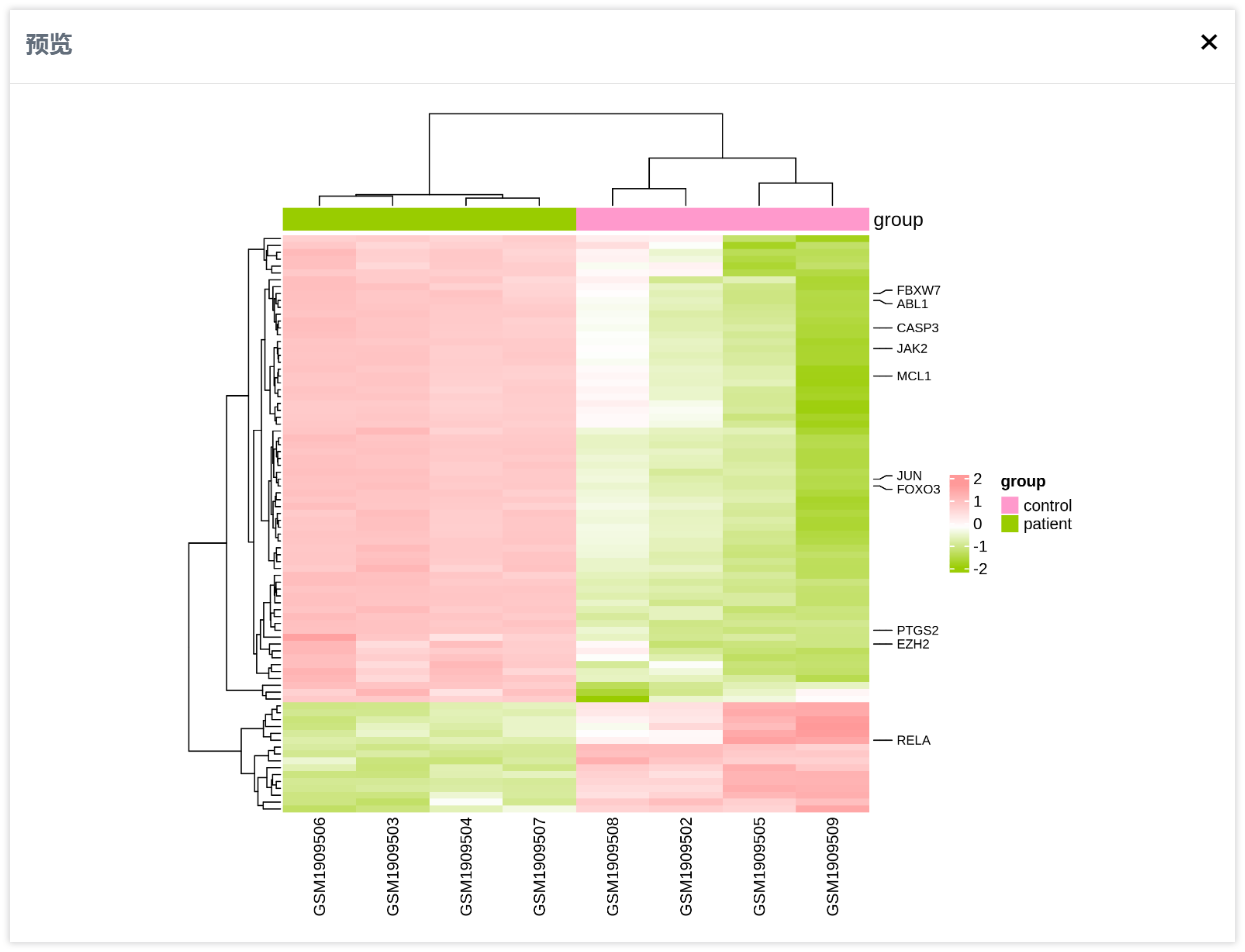
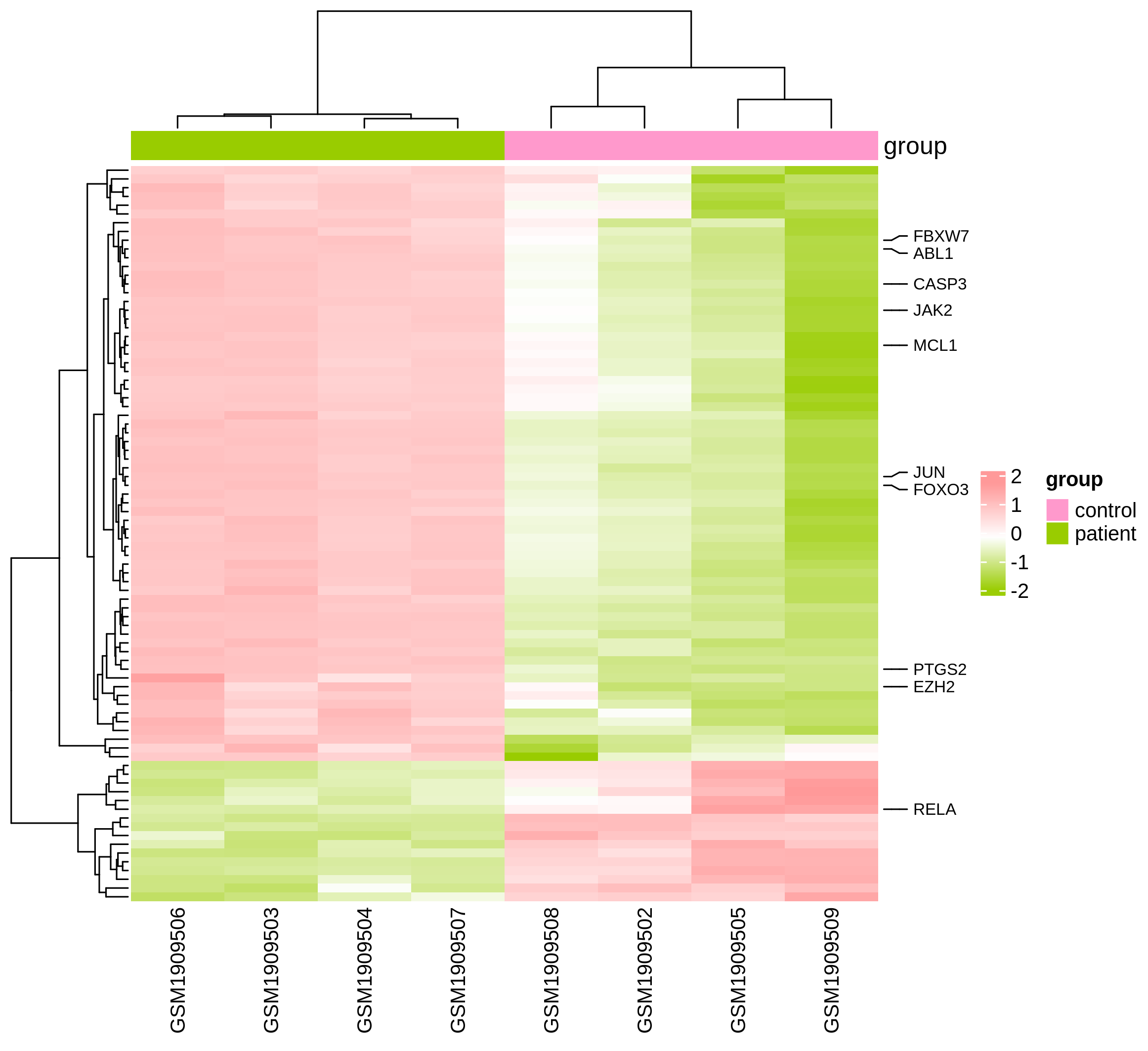
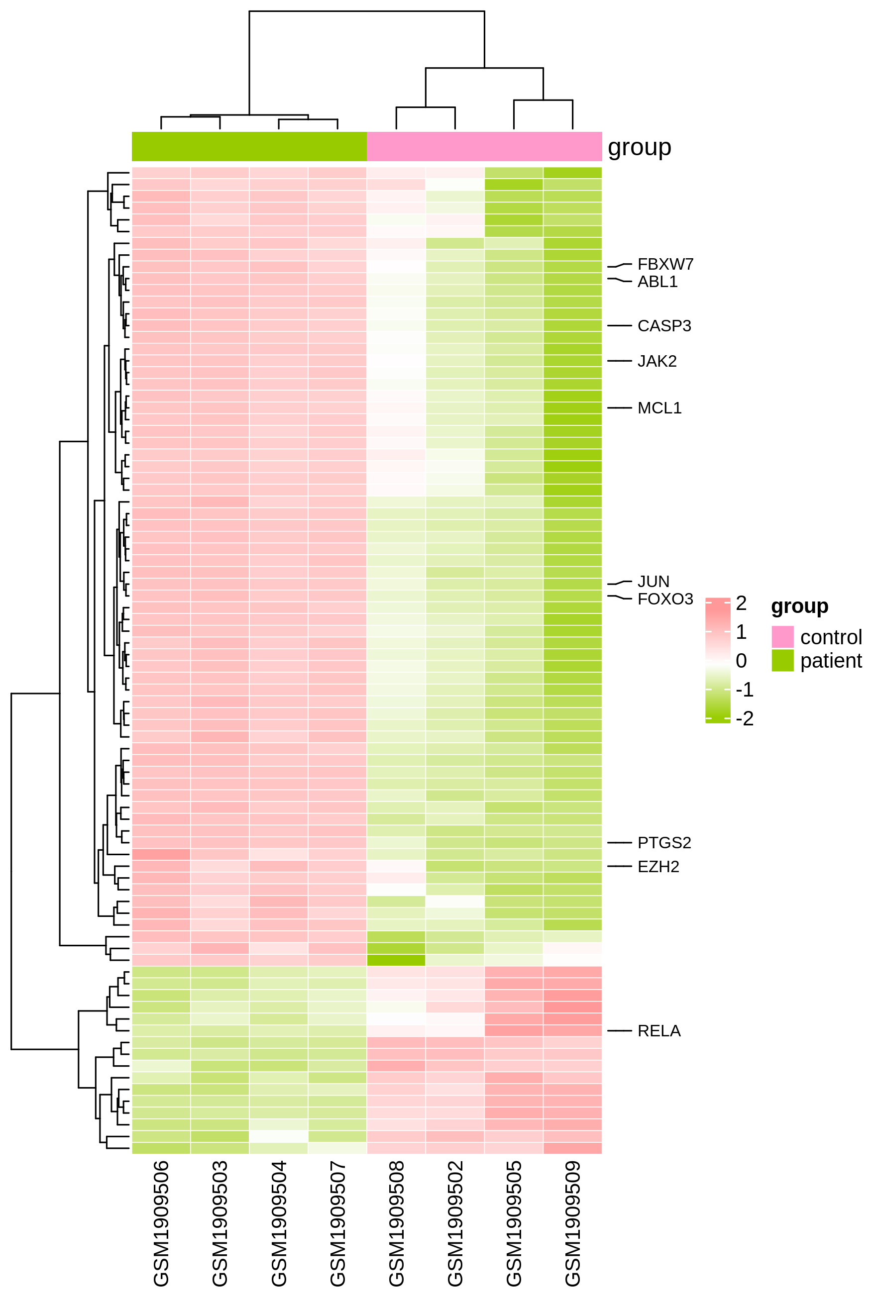
热图的配色方案这里选择“olive white pink”,即橄榄绿、白色、桃红色。由于分组文件中包含两个分组,所以分组颜色这里添加了粉红色和黄绿色(#FF99CC,#99CC00),如下图。格子的长度x高度这里设置为16mm x 1.5mm,其他的选项保持默认,然后点击提交按钮即可。
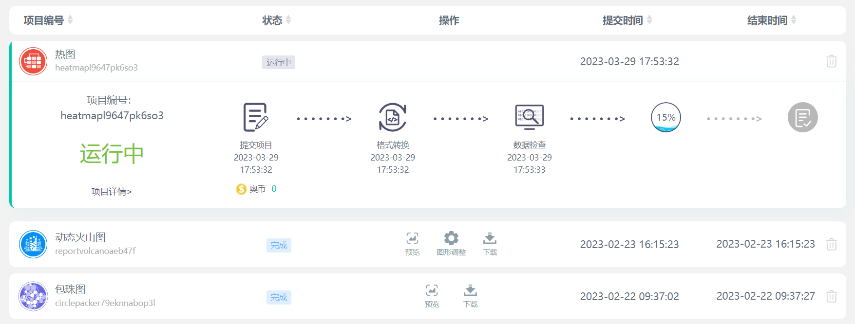
在左侧导航栏中点击我的项目查看任务进度,任务完成后点击预览按钮可以查看热图绘制效果。
预览窗口如下:
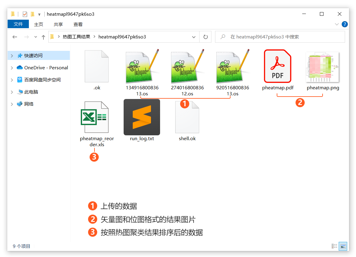
在我的项目页面,点击下载按钮可下载绘图结果文件。结果文件夹中主要包含4种文件,最重要的是PDF和PNG格式的图片,“pheatmap_reorder.xls”文件为按照热图聚类结果重新排序后的表达量数据,以“.os”为拓展名的文件为大家上传的原始数据,其他文件为任务状态文件。
最终得到的热图如下:
当然,也可以通过调整格子的长度和高度,设置整个热图的比例,效果如下图。这里将格子的描边颜色设置为白色,描边粗细设置为0.5。
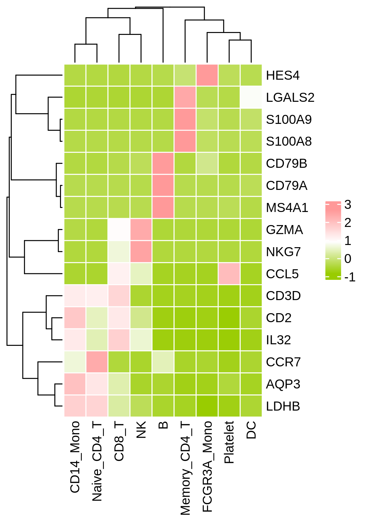
如果数据量较小,也可以选择绘制方格热图,这时我们可以适当调小聚类树的高度,并将格子的长度、高度都设置为6mm。
绘制效果如下:
Q1.热图工具用什么方法进行归一化?
Z-score
Q2.提交为什么提示有重复?
热图第一列样本名不允许有重复,请参照提示查找重复的样本名,修改区分或删除
Q3. 为什么出图顺序跟文件不一样?
选择聚类,会改变横/纵坐标的排列顺序。
如果需要使用热图直观呈现基因在样本中的变化规律,顺序已经在文档中定义好,不希望被打乱,可以选择把聚类功能关掉。
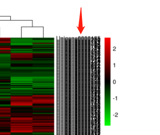
Q4. 热图中这些黑黑的条形是什么?调整方法是什么:
这一列为基因名,但由于基因数过多,名称被挤压。一般使用建议挑选差异基因或感兴趣的基因等进行热图绘制。
调整方法:可以单独准备一个标签文件,仅显示少数感兴趣的基因。

如果上传一个“空文件”(至少包含一个热图不存在的标签),绘制的热图则不展示标签。当然,也可以直接选择隐藏标签。
Q5. 如何修改配色?
热图工具修改配色,需要在任务提交页面进行修改。工具默认提供2种配色,您也可以输入色号代码,绘制喜欢的配色方案。

Q6.下载的结果文件用什么软件打开?
OmicShare云平台的结果文件(例如,下图为KEGG富集分析的结果文件)包括两种类型:图片文件和文本文件。

图片文件:
为了便于用户对图片进行后期编辑,OmicShare同时提供位图(png)和矢量图(pdf、svg)两种类型的图片。对于矢量图,最常见的是pdf和svg格式,常用Ai(Adobe illustrator)等进行编辑。其中,svg格式的图片可用网页浏览器打开,也可直接在word、ppt中使用。
文本文件:
文本文件的拓展名主要有4种类型:“.os”、“.xls”、“.log”和“.txt”。这些文件本质上都是制表符分隔的文本文件,使用记事本、Notepad++、EditPlus、Excel等文本编辑器直接打开即可。结果文件中,拓展名为“.os”文件为上传的原始数据;“.xls”文件一般为分析生成的数据表格;“.log”文件为任务运行日志文件,便于检查任务出错原因。
Q7. 提交的任务一直在排队怎么办?
提交任务后都需要排队,1分钟后,点击“任务状态刷新”按钮即可。除了可能需运行数天的注释工具,一般工具数十秒即可出结果,如果超出30分钟仍无结果,请联系OS客服,发送任务编号给OmicShare客服,会有专人为你处理任务问题。
Q8. 结果页面窗口有问题,图表加载不出来怎么办?
尝试用谷歌浏览器登录OmicShare查看结果文件,部分浏览器可能不兼容。
引用OmicShare Tools的参考文献为:
Mu, Hongyan, Jianzhou Chen, Wenjie Huang, Gui Huang, Meiying Deng, Shimiao Hong, Peng Ai, Chuan Gao, and Huangkai Zhou. 2024. “OmicShare tools: a Zero‐Code Interactive Online Platform for Biological Data Analysis and Visualization.” iMeta e228. https://doi.org/10.1002/imt2.228案例1:
发表期刊:Frontiers in cell and developmental biology
影响因子:5.5
发表时间:2021

FIGURE 2. (F) Heatmap of lncRNA-seq analysis from a single GBM biopsy (GBM cells treated with 800 ng/ml rhHMGB1, n = 3; control GBM cells, n = 3). Two hundred and twenty-one lncRNAs were identified with a cut-off of >1.2-fold for gene expression change and p < 0.05. (G) Heatmap of miRNA-seq analysis from a single GBM biopsy (GBM cells treated with 800 ng/ml rhHMGB1, n = 3; control GBM cells, n = 3).
引用方式:Data analysis was performed using the OmicShare tools at www.omicshare.com/tools.
参考文献:
Gao X Y, Zang J, Zheng M H, et al. Temozolomide treatment induces HMGB1 to promote the formation of glioma stem cells via the TLR2/NEAT1/Wnt pathway in glioblastoma[J]. Frontiers in cell and developmental biology, 2021, 9: 620883.
案例2:
发表期刊:Journal of Cellular Physiology
影响因子:5.6
发表时间:2022

FIGURE 5 Enrichment analysis identifies Schwann cell subtype characteristics. (a) Gene set variation analysis (GSVA) enrichment analysis of hallmark gene sets in Schwann cell subtypes. Red color represents upregulation and blue color represents downregulation.
引用方式:We thank GENE DENOVO Company for bioinformatics analysis support with OmicShare Analysis Platform (http://www.omicshare.com/tools).
参考文献:
Zhang R, Chen Q, Huang L, et al. Single‐cell analyses reveal the differentiation shifts of Schwann cells in neonatal rat sciatic nerves[J]. Journal of Cellular Physiology, 2022, 237(1): 637-646.
案例3:
发表期刊:Journal of Hazardous Materials
影响因子:13.6
发表时间:2023

引用方式:and a differential metabolite (DEM) heat map were performed using the OmicShare bioinformatics learning platform (www.omicshare.com/tools).
Fig. 4. Effects of tritium exposure on expression patterns of nucleotides, carbohydrates, and amino acids.
参考文献:
Huang Y, Qin M, Lai J, et al. Assessing OBT formation and enrichment: ROS signaling is involved in the radiation hormesis induced by tritium exposure in algae[J]. Journal of Hazardous Materials, 2023, 443: 130159.
案例4:
发表期刊:EBioMedicine
影响因子:11.1
发表时间:2022

Figure 2. DYRK1A knockdown induces transcriptional reprogramming of networks that govern cardiomyocyte cell cycle activation. (b) Heatmap profile of RNA-sequencing (RNA-seq) analysis to show differentially expressed genes in primary neonatal cardiomyocytes transfected with scramble (si-NC) or DYRK1A siRNA (si-DYRK1A) (n=3 samples per group). (c) Gene ontology (GO) analysis of upregulated genes in si-DYRK1A cardiomyocytes (relative to si-NC group) show multiple, significantly enriched GO terms relevant to cell proliferation. (d) Heatmap profile of upregulated cell cycle regulators (relative to si-NC group).
引用方式:Heatmaps of gene expression, gene ontology (GO) and Kyoto encyclopedia of genes and genomes (KEGG) pathway analyses were performed using the OmicShare tools, a free online platform for data analysis (http://www.omicshare.com/tools).
参考文献:
Lan C, Chen C, Qu S, et al. Inhibition of DYRK1A, via histone modification, promotes cardiomyocyte cell cycle activation and cardiac repair after myocardial infarction[J]. EBioMedicine, 2022, 82.
案例5
发表期刊:Horticulture Research
影响因子:8.7
发表时间:2022

Figure 2. b Top 10 metabolites from the positive and negative loadings of PC1 and PC2, respectively.
引用方式:
Heatmaps of the top 10 metabolites from PC1 and PC2 were produced from ion intensity data using the online OmicShare Heatmap tools (http://www.omicshare.com/tools).
参考文献:
Liu W, Wang Q, Zhang R, et al. Rootstock–scion exchanging mRNAs participate in the pathways of amino acid and fatty acid metabolism in cucumber under early chilling stress[J]. Horticulture Research, 2022, 9: uhac031.