扫码支付更轻松

Function:
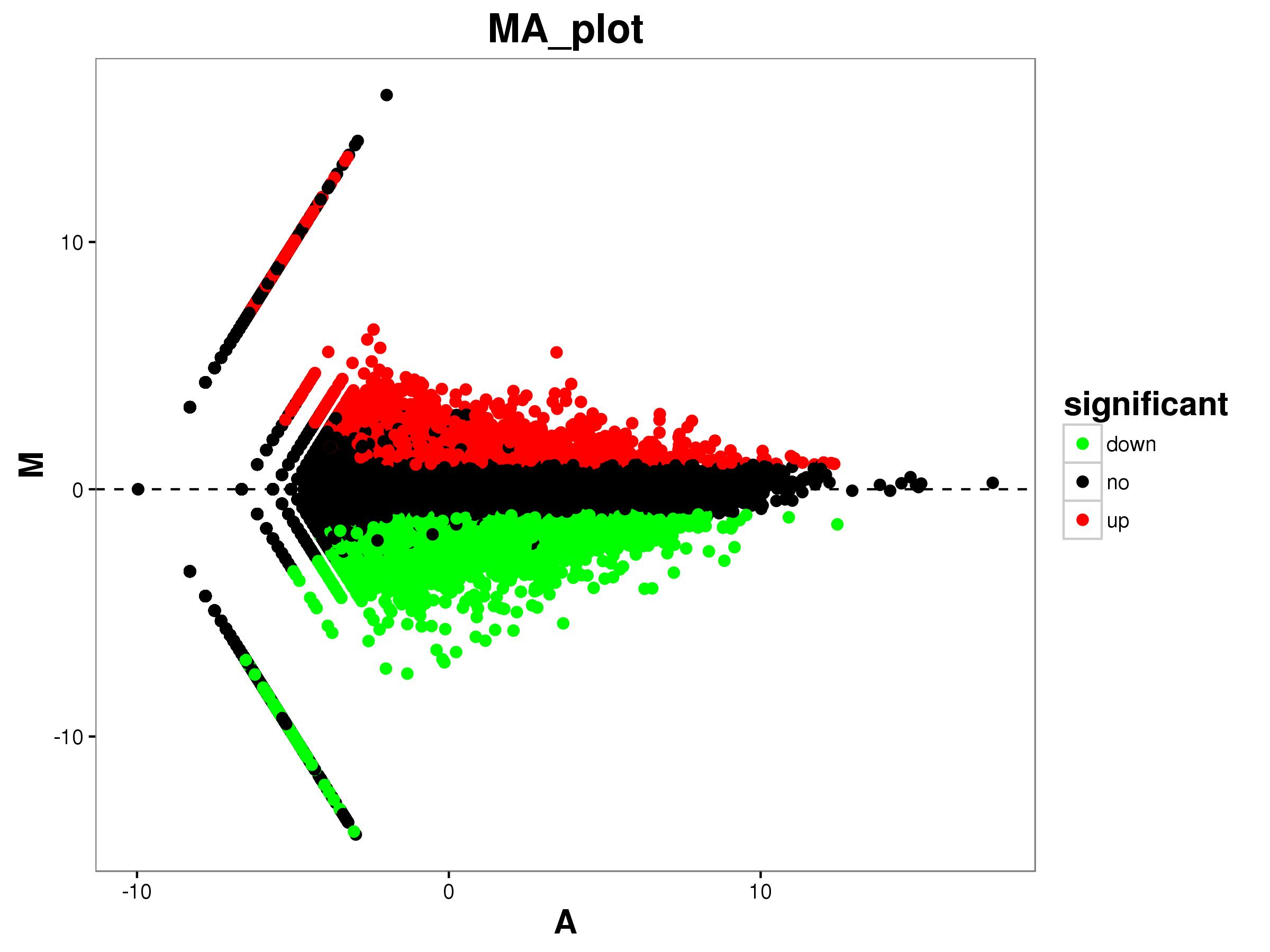
Create MA-plots based on dependences between the log ratio (M, represents differences) and the mean values (A, represents intensity) of the same two variables. Different colors (normally red and green) show data with significant changes (|log2|>1 & p value<0.05). M and A are defined by the following equations:


Input:
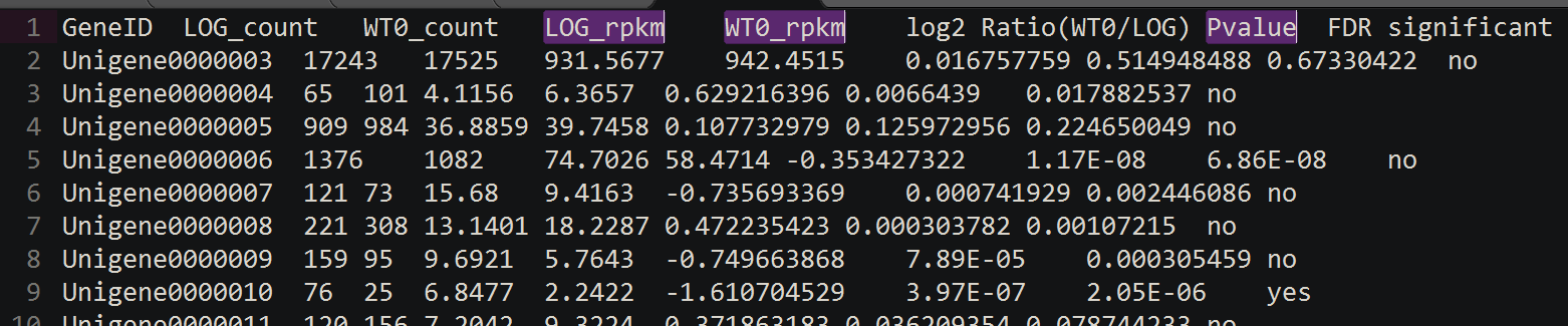
Format of input file: the input file should be a tab-delimited “.tsv” or “.txt” file.
Parameters:
①Chart title: define chart title, the default title is: “MA plot”
②Dot size: define dot size, the default value is 1.
③X-axis label: define the horizontal axis title, the default title is: “A”
④Y-axis label: define the vertical axis title, the default title is: “M”
⑤Column number of first sample (data): select which column of data presenting the first sample
⑥Column number of second sample (data): select which column of data presenting the second sample
⑦Column number of p value/ q value: select which column of data using as p value / q value
Output:
A MA plot in PNG/PDF format.
Example:
MA diagram example fileOutput:
In the task interface, click on the “download” button to download MA plot results in PNG and PDF format.