


 扫码支付更轻松

1. Description
Heatmap mainly use gradient colors to show the changes of data in different samples. This tool not only supports adding annotations to heat maps, but also can specify text labels. Even for heat maps containing hundreds of genes, gene labels will not overlap.
For more details and examples, please refer to>>
https://www.omicshare.com/forum/thread-407-1-1.html
2. Applications
Applicable to transcriptome, metabolome, proteome, 16S, experimental results, etc.
3. Data file
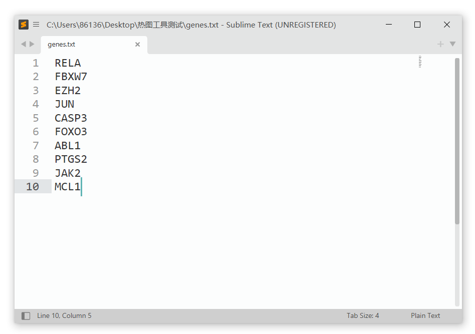
Matrix dataset file: Any abundance-related expression data can be used as heatmap data. The first row is the sample name, and the first column is the gene name, protein name, and so on, as shown below. Note that the column name of the first column cannot be empty!

Label file (optional): A single-column text file used to add specific text labels to the heat map. Note that these text labels must be found in the first column of the Matrix dataset file.
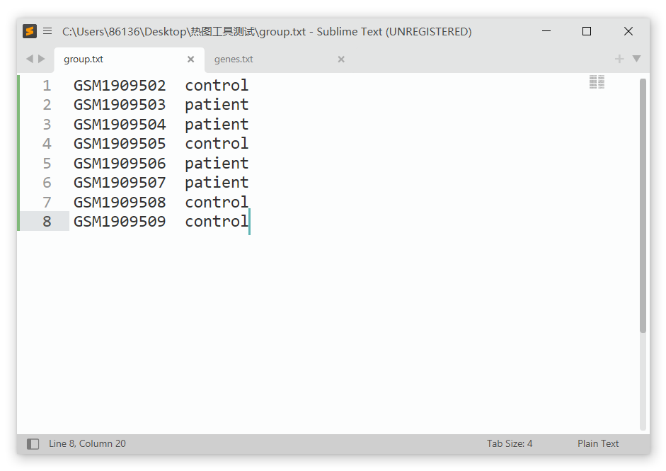
Group file (not required): two-column text file, column 1 must be the sample name and column 2 must be the group name. Note that the sample name must match the column name of the Matrix dataset file.
The input file supports tab-separated text files, csv(comma separated) text files, and xlsx format, as well as xls(Excel 97-2003) format of older versions of Excel.
4. Arguments
a. Select a column for plotting:
Select which columns in the Matrix dataset file are used to draw the heat map. For example, filling in "2-4, 6-8" means that only 6 columns of data (2, 3, 4, 6, 7 and 8) are selected to draw the heat map (the first column is not included because it contains gene names); If NULL, all columns will be used for drawing by default.
b. Scale:
Perform Z-score normalization on the data, select columns, rows or not, and select rows for normalization by default.
c. Cluster:
Choose whether to cluster rows/columns (Hierarchical clustering). By default, both rows and columns are clustered.
Displays the cluster tree:Whether show column dendrogram or row dendrogram?
Height and Width of the dendrogram:Height of the column dendrogram and Width of the row dendrogram,default 20mm.
d. display_numbers:determining if the numeric values are also printed to the cells.
e. Color:
Color scheme selection: default green black red, with the option to select either navy white firebrick3 or olive white pink; You can also customize, add colors to the palette or directly enter hexadecimal color numbers (comma separated).
Grouping Color: customize the color of the grouping annotation bar, and the number of added colors should be the same as the number of groups in the grouping file.
f. fontsize:fontsize for rownames and colnames,default 10 pt(points).
g. cellwidth and cellheight:individual cell width and height in mm. If left as blank, then the values depend on the size of plotting window. If you plot a grid heat map, you can set the length and height of the cell to the same value, for example, 5x5. Note that the size of the cell ultimately affects the size of the entire heat map.
First, upload the image data. Click on the "Select File" button and upload the expression table file, label file, and grouping file. Select normalization by row as the data processing method, and cluster rows and columns as shown in the figure below.

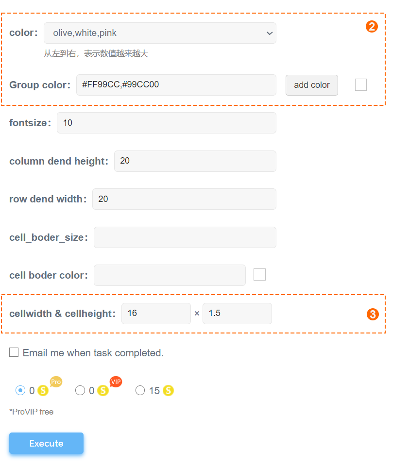
The color scheme for the heatmap is chosen as "olive white pink", which includes olive green, white, and peach-pink. Since the grouping file contains two groups, pink and yellow-green (#FF99CC, #99CC00) are added as group colors as shown in the figure below. The size of each cell is set to 16mm x 1.5mm, while other options are kept default. After setting up, you can click the "submit" button to proceed.
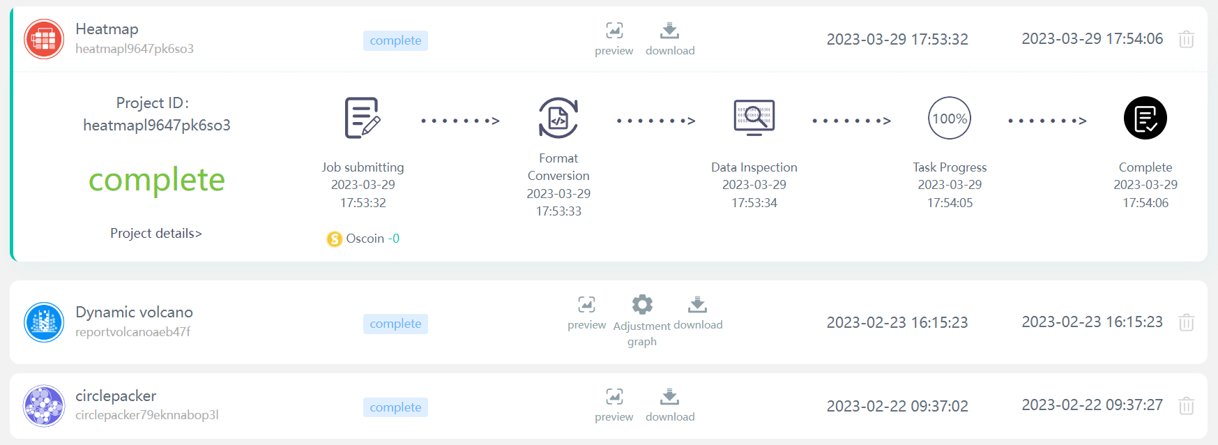
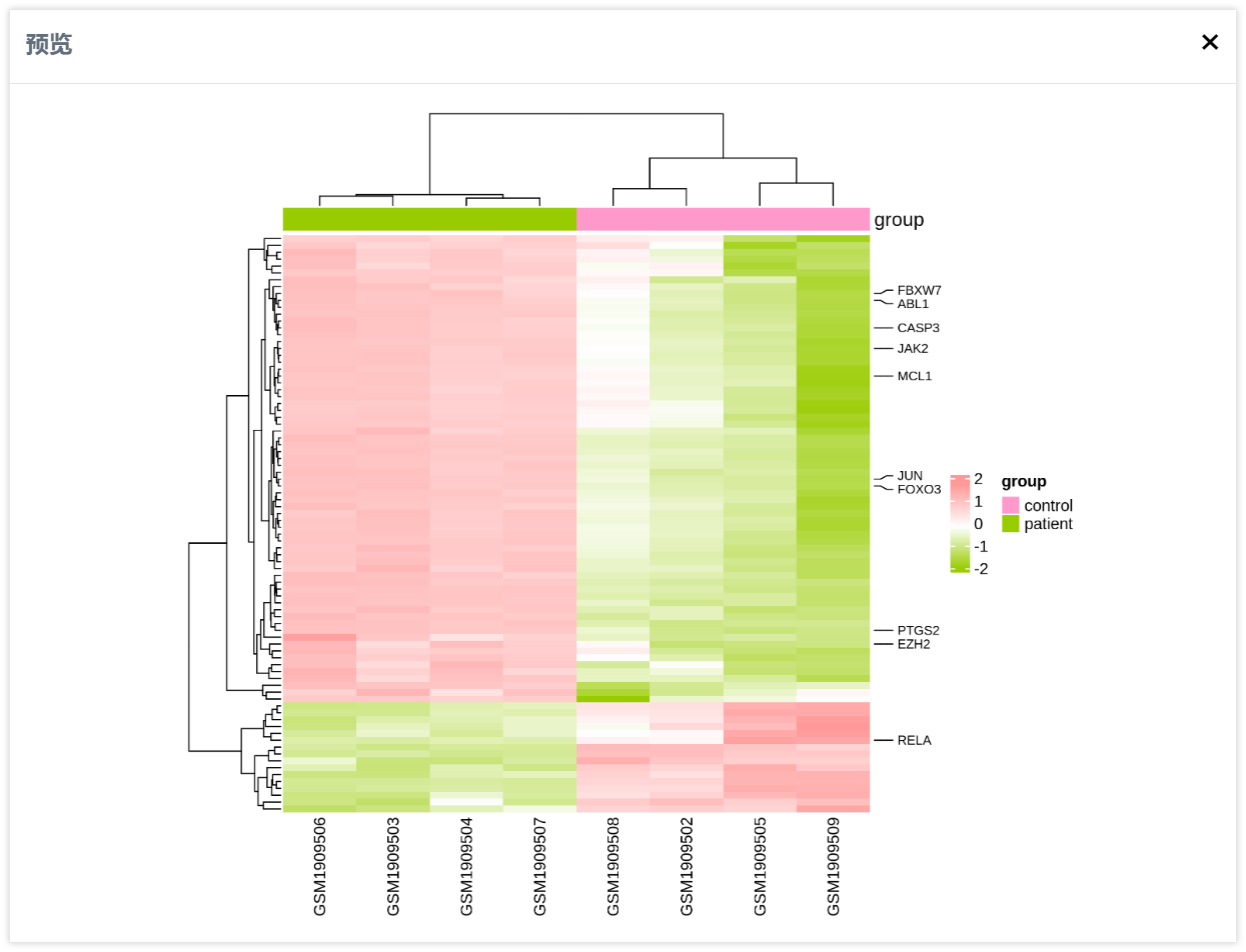
Click on "My Projects" in the left navigation bar to check the progress of your task. After the task is completed, click on the "Preview" button to view the heatmap visualization result.
The preview window is as follows:
On the "My Projects" page, clicking on the download button allows you to download the plotted result files. The result folder mainly contains four types of files, where PDF and PNG format images are the most important. The "pheatmap_reorder.xls" file contains expression data reordered according to the clustering results of the heatmap. Files with a ".os" extension are the original data uploaded by users, while other files are task status files. The final heatmap is shown below:
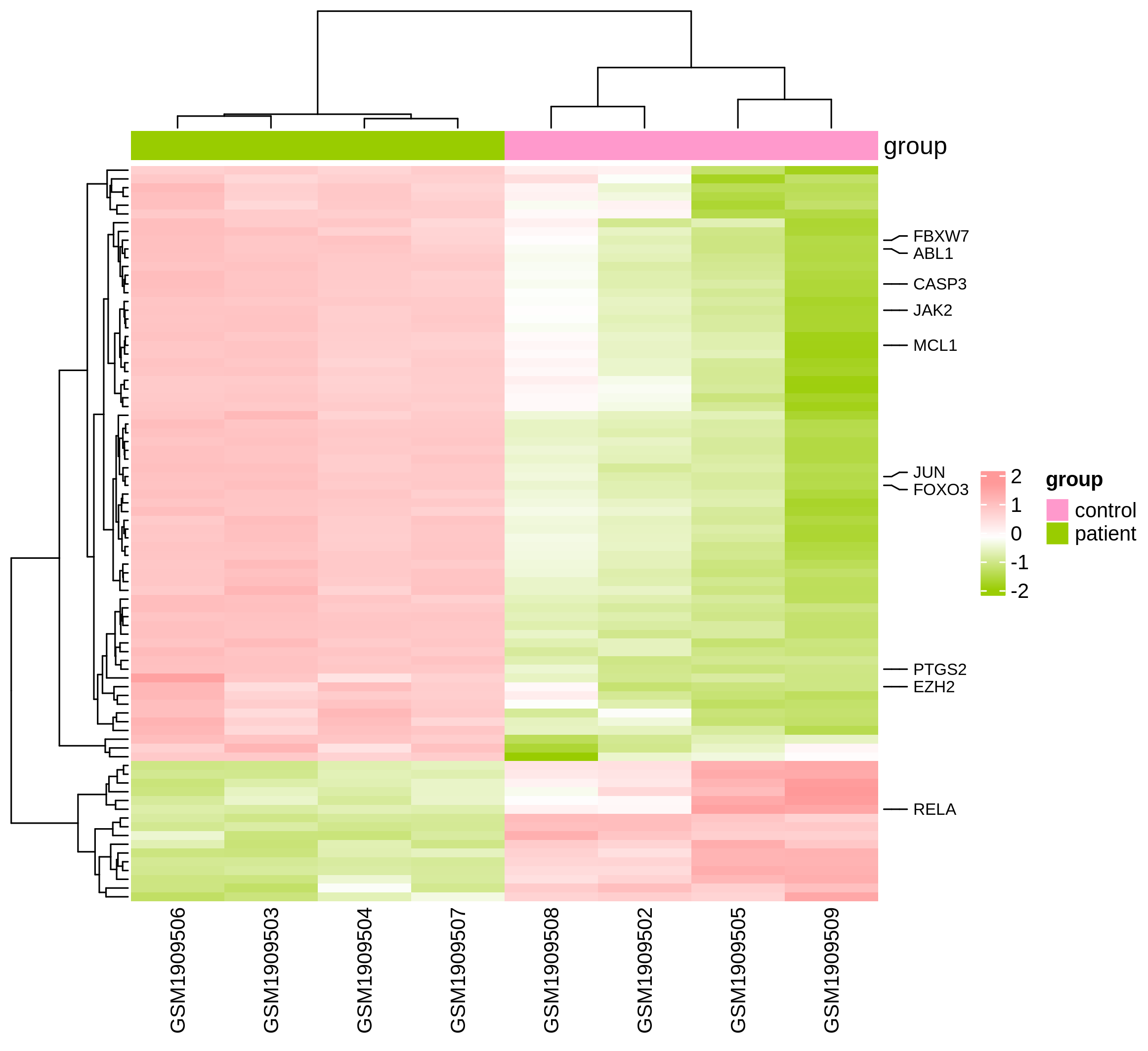
Of course, you can also change the size of the cell by adjusting the length and height of the cells and setting the overall scale of the heatmap. Additionally, you can set the cell border color to white and the border thickness to 0.5 to achieve a border effect.

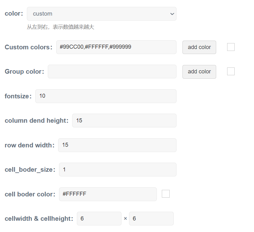
If the data volume is small, a heatmap with square grids can also be used. In this case, it is recommended to reduce the height of the clustering tree and set the length and width of each cell to 6mm.
The final heatmap is shown below:
