扫码支付更轻松

Threshold filtering
Graphic modification

1. Description
A Venn diagram is used to show the intersection between data sets. In a Venn diagram, different data sets are represented by shapes such as ellipses or circles, and the overlapping areas between the circles represent the intersection between the data sets. This tool supports the creation of Venn diagrams using filtered element data files or abundance data files, and it can extract information about subsets of elements.

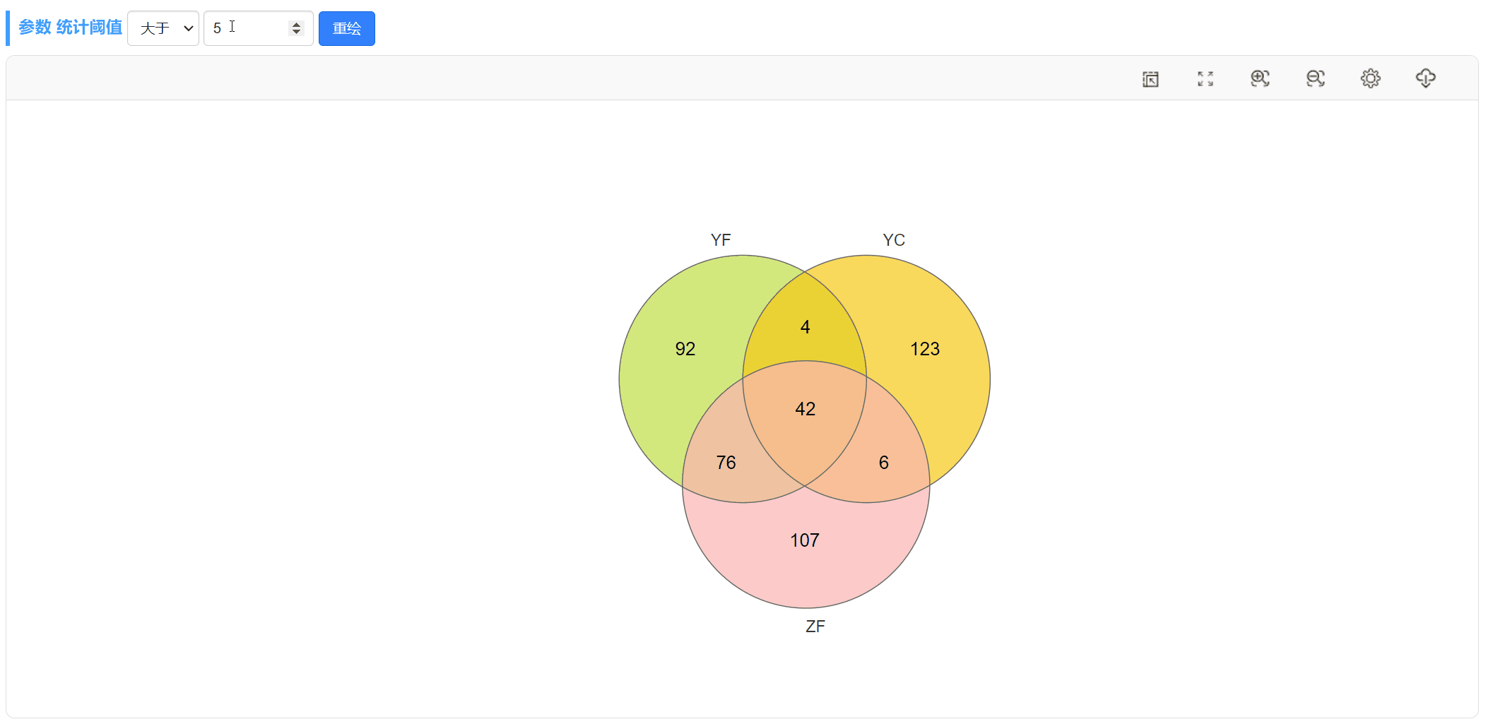
Taking the Venn diagram of samples YF and YC (the first one) as an example, you only need to upload an OTU abundance table that contains these two columns of data. By setting the threshold for OTU abundance to > 0, you can view the unique and shared OTUs between these two samples. Please note that the outline thickness of the shapes in the diagram is set to 0.
2. Data file
The Venn Diagram tool supports two types of data.
2.1. Element data file
The format of the element data file is relatively easy to understand. Each column represents a group, and the text in each cell represents an element (such as a differentially expressed gene) in the current group. The column names are the group names, and the number of elements in each group is generally different, as shown in the following table.

2.2 Abundance data file
The format of the abundance data file is also very simple. The first column of the table contains the element names (such as gene ID, OTU ID), and the following columns represent the abundance values of each element in different groups (numerical values). The column names represent the group names, as shown in the table below.

When you choose to upload the "abundance data file", you can filter the qualified elements of each sample (grouping) by specifying a threshold (such as filtering OUT the tags value greater than 0 in the sample), and then use a graph to show the common relationship between these elements among different samples (grouping).
3. Results
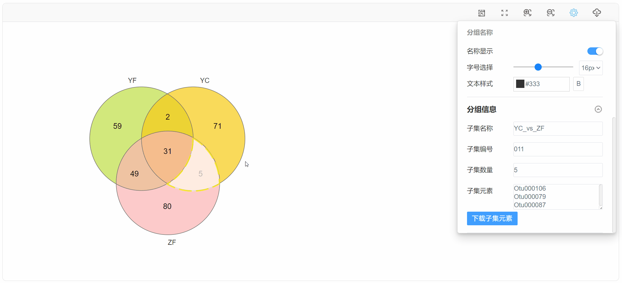
The generated Venn diagram can be personalized by adjusting various options such as modifying the color scheme, border thickness, and viewing/download subset element information.
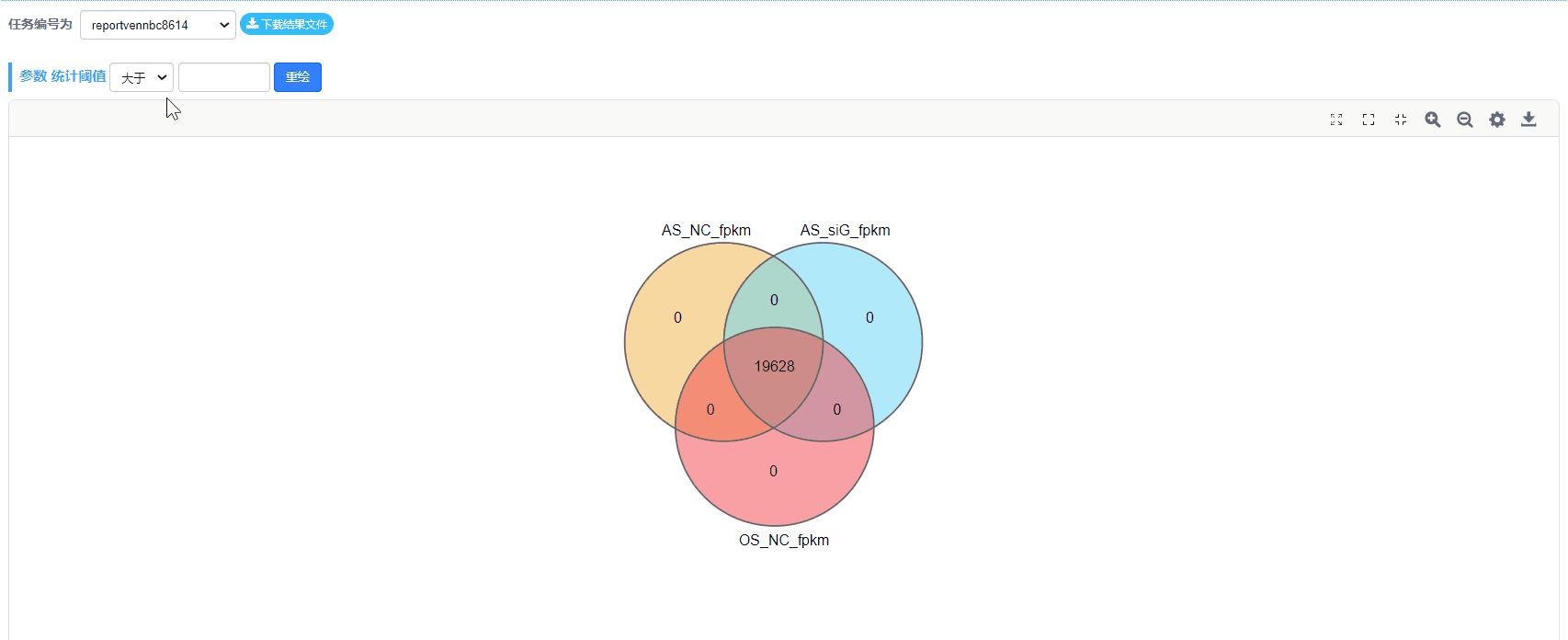
Additionally, when selecting the "abundance data file" for upload, we can also change the threshold at any time and redraw the plot. For example, we can filter out OTUs with an abundance greater than 0 or genes with a fold change greater than 2 to create the Venn diagram.